
Wedding Photography & Planning
Plan for Different Guest Tech Levels (Picshots)
Not everyone loves apps—so you need a photo plan that works for every guest. Here’s how to design simple, low-friction participation using simple wedding guest photo capture with Picshots.
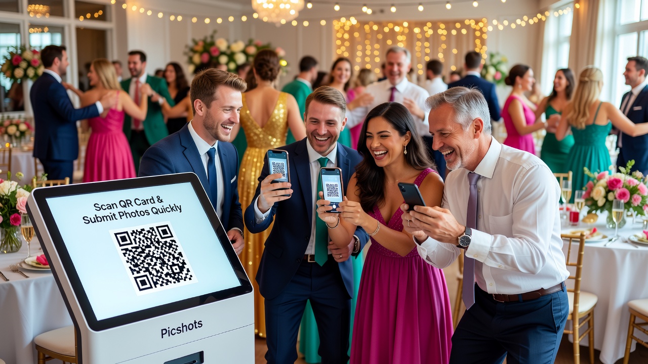
simple wedding guest photo capture with Picshots: plan for different guest tech levels
Quick Answer: Build a guest photo plan that adapts to different tech comfort levels. Use one-click participation (QR + clear steps), offer a no-login option when possible, and include offline-friendly fallbacks like printed prompts and a help point. With Picshots, guests can contribute confidently without app anxiety.
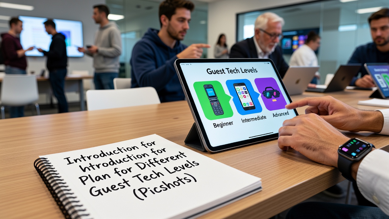
Introduction
Weddings are joyful—and also busy. One common frustration is that not every guest wants to install an app, log into accounts, or troubleshoot Wi‑Fi at the worst possible moment. If you’ve ever watched an excited aunt put her phone down because “this is too complicated,” you already know the real problem: participation friction.
This guide helps you plan a simple wedding guest photo capture with Picshots that works for everyone—from the tech-savvy photographer in the front row to the guest who only opens their camera when it’s time for a toast. You’ll learn how to plan, what to prepare, and how to structure instructions so participation feels effortless.
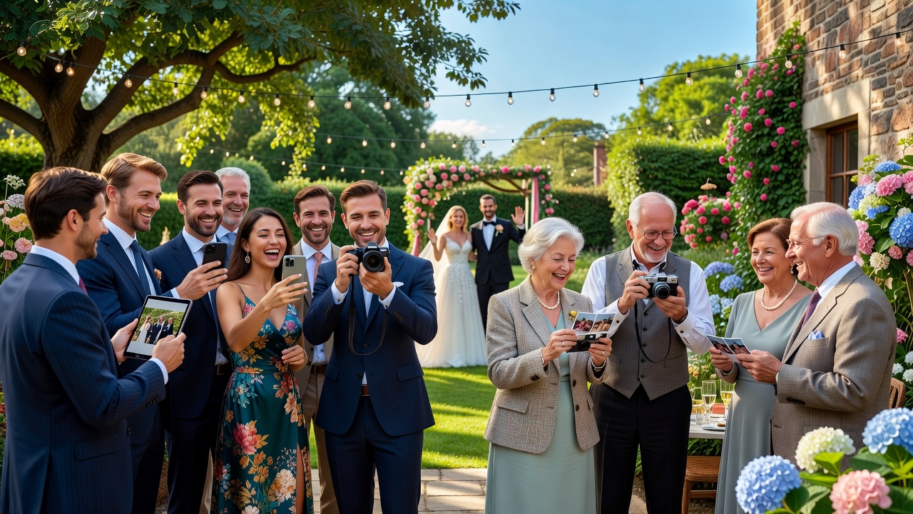
What does “different tech comfort levels” mean at a wedding?
“Tech comfort” isn’t just about age. It’s about confidence with common steps like scanning a QR code, sharing permission prompts, and navigating an in-app flow—especially under time pressure. At weddings, these comfort levels tend to split into a few practical groups.
Use these categories to design your plan:
- Low-friction users: Comfortable with scanning, buttons, and sharing—but hate complexity and delays.
- App-averse users: Will participate, but only if you keep things simple (no installs, minimal steps).
- Help-needed users: Will try, but will pause at the first confusing moment (permissions, loading, “what now?”).
- Power users: Happy to explore features, add photos fast, and help others.
The goal is not to “teach everyone technology.” The goal is to remove steps so everyone can contribute confidently.
How do you reduce friction for guests who don’t love apps?
A frictionless plan has one job: make the next action obvious. That means designing your guest journey like a short, guided path with minimal decisions—plus safety nets.
In the first 15 minutes, your plan should do three things:
- Show participation as easy: One QR, one prompt, one clear outcome (“Upload your photo”).
- Explain only what’s necessary: Short instructions that match what guests actually see on their screens.
- Guarantee a fallback: If someone can’t scan or upload, they still feel included.
If you want a concrete framework, use “Progressive Onboarding”: start with the simplest path first, then add complexity only for guests who need it.
Make the participation flow “one screen deep”
Under stress, people don’t want branching. Aim for a flow where guests see:
- Step 1: Scan (or tap) the QR
- Step 2: Follow one prompt (capture or upload)
- Step 3: Confirm
Practical example: If your instructions say “Scan the QR, sign in, pick an album, then upload,” you’ve already lost the app-averse crowd. Instead, keep the wording aligned with the simplest experience supported by your tool.
Use “permission clarity” so sharing doesn’t feel scary
Many guest hesitations come from uncertainty about permissions (camera access, photo gallery access, and uploads). Don’t hide behind technical language. Use plain phrases like:
- “Allow camera access so we can capture photos.”
- “You can take a photo and submit it in a few seconds.”
- “No need to create an account (if that’s true for your flow).”
That’s more reassuring than vague promises—and it prevents “I’ll do it later” drop-offs.
How should you prepare signage and instructions for every tech level?
Your signage is your silent host. The best instructions feel like a friendly checklist, not a manual.
Target your signage to scan-and-go behavior:
- Short headline: “Add your photo here” or “Join the guest photo capture.”
- Two to three steps max: “Scan → Take/Choose → Submit.”
- One “if stuck” line: “If the QR doesn’t work, ask for help at the info desk.”
- Visibility matters: Put signage at photo hotspots (entry, near the bar, near the dance floor).
Featured-snippet-friendly tip: If you want your guests to act immediately, print instructions that match the exact labels on the screen they’ll see after scanning.
Write “microcopy” that matches the moment
Microcopy is the tiny text that prevents confusion. Here are example lines that work well across comfort levels:
- Low tech: “Scan with your camera app or a QR scanner.”
- App-averse: “No complicated setup—just scan and submit.”
- Help-needed: “If you see an error, try scanning again. If it still fails, ask our helper.”
Keep the tone warm and calm. When guests feel safe, they try.
Where should you place QR codes (and why placement beats persuasion)?
Guests don’t “learn” your photo tool at a distance. They engage when they’re already motivated to take photos—like right before the ceremony, during cocktail hour, or between dances.
Best placement strategy: Position QR codes where guests naturally look up and lift their phones:
- Reception entry: First chance to participate.
- Near photo backdrops: People want to take pictures anyway.
- Near the bar or snacks: Guests hang out longer; they have time to scan.
- Photo “high moment” zones: For example, right beside the dance floor or after big announcements.
Avoid: Putting QR codes only on tables where guests never look, or only in one far corner of the venue.
Use redundancy without overwhelm
Two to three QR points across the event can dramatically increase participation without adding complexity. If you add more, keep the instructions consistent so guests don’t wonder if they’re in the wrong place.
What “fallback options” keep guests included when tech fails?
Even with the best plan, occasional issues happen: poor connectivity, a camera that can’t scan, or a phone that won’t load quickly. A good guest photo plan assumes friction might occur—and includes a dignified path forward.
Fallbacks that respect every guest’s comfort level:
- A help point: One person (or designated assistant) who can step in calmly.
- Printed instructions with the same steps: Not just the QR, but the “what to do next.”
- Manual handoff: If your workflow supports it, allow the helper to assist with submission.
- Time window: Give guests a range (“From 6:00–7:00 PM”) so they don’t feel rushed.
Key principle: Don’t make people feel like failures. Offer support as part of the plan.
How does Picshots fit into a low-friction guest photo strategy?
Picshots is designed for quick participation, which is exactly what you need when some guests aren’t excited about apps. The core idea is to reduce the “setup burden” and make contribution feel immediate.
How to think about it:
- Low cognitive load: Guests focus on taking photos, not figuring out an onboarding flow.
- Speed: QR-based participation supports fast start, especially during high-energy moments.
- Confidence: Clear steps and reassurance reduce hesitation for app-averse guests.
Actionable planning tip: Treat your Picshots setup as part of your event operations. Decide where QR signage goes, assign a helper, and prepare printed instructions that mirror the simplest on-screen steps.
Step-by-step: Plan your guest tech-level friendly photo capture
Below is a wedding-ready checklist you can follow without overthinking. It’s optimized for reducing friction across different guest comfort levels.
Step 1: Map your guest comfort mix
Answer these internally before event day:
- Which guests are likely app-averse?
- Who will be the “tech champion” at your event?
- Where do guests naturally gather and take photos?
Step 2: Choose simple participation moments
Don’t ask people to participate at random times. Pick moments that already create motivation:
- Arrival + cocktail hour
- After ceremony photos
- During key celebrations (toasts, first dances)
Step 3: Prepare signage that matches the flow
Create a small set of consistent instruction cards:
- Headline: “Join the guest photo capture”
- Steps: “Scan → Take/Choose → Submit”
- Fallback: “Ask the helper if you get stuck”
Design principle: Use readable fonts and high contrast. If guests can’t see it quickly, the experience fails.
Step 4: Assign a calm helper
This matters for app-averse and help-needed guests. Choose someone who:
- Communicates slowly and kindly
- Can troubleshoot scanning/loading issues
- Doesn’t shame anyone (“Just try it again.” instead of “Why won’t it work?”)
Step 5: Run a 5-minute test before guests arrive
This isn’t optional if you want confidence. Do a quick check:
- Does the QR scan reliably?
- Does submission complete successfully?
- Do the instructions match what guests see?
- Is the helper able to assist in under 30 seconds?
Step 6: Communicate reassurance, not instructions overload
Instead of lengthy directions, provide a simple invitation:
- “Add your photo to the guest collection.”
- “It takes about a minute.”
- “If you’re stuck, our helper can assist.”
Reassurance is a feature.
Common mistakes that reduce participation (and how to avoid them)
These are the most frequent failure points when you plan for mixed tech comfort levels.
1) Making guests do too many steps
If guests must sign in, choose albums, and then confirm uploads, app-averse guests will stop. Reduce decisions. Aim for “scan + submit” at the core.
2) Ignoring permissions and loading delays
If guests see permission prompts without explanation, they may deny automatically. Add clear, friendly lines like “Allow camera access.”
3) Putting QR codes in low-visibility locations
It doesn’t matter how good your tool is if guests never see the QR. Place it where phones are already out.
4) No fallback plan
Without an “ask for help” path, stuck guests feel excluded. Add a helper role and a clear rescue path.
5) Instructions that don’t match the real screen
Guests follow what they see. If your signage says “Tap Submit,” but the screen says something else, confusion spikes. Keep terminology aligned.
How to compare alternatives (and why simplicity usually wins)
There are multiple ways to collect guest photos. Here’s how to evaluate them without getting trapped in feature lists.
Comparison criteria:
- Setup burden: How much setup is required for guests?
- Onboarding time: How long until a guest can submit?
- Complexity: Are there multiple steps or choices?
- Support needs: Will someone need to troubleshoot at the venue?
- Accessibility: Is the flow readable and usable across devices?
General guidance: For mixed tech comfort levels, prioritize tools and flows that support “quick participation” and minimize setup steps. That’s typically what leads to better participation rates.
Costs and planning effort: what to budget for
Exact pricing depends on your chosen tool and event setup, but you can budget categories so surprises don’t derail you.
- Tool costs: Many platforms charge based on event features or participation.
- Signage materials: Print QR cards, instruction sheets, or table signs.
- Personnel time: Your helper’s role is part of the “real cost.” Plan training time.
- Testing time: Include a short rehearsal or tech check before guests arrive.
Best practice: Treat this as operational planning. The more friction you remove before guests arrive, the less time you spend fixing issues during the event.
Accessibility best practices for guest photo capture
Accessibility is more than compliance—it’s kindness. When you design for clarity, you serve everyone, including guests with visual or cognitive load challenges.
Simple accessibility checklist:
- Readable contrast: Ensure QR cards and text are legible from a distance.
- Short sentences: Make instructions easy to scan.
- Clear language: Use “scan,” “submit,” and “ask for help,” not jargon.
- Consistent terminology: Match on-screen wording to signage wording.
If you want a baseline framework for accessibility principles, you can review WCAG concepts (World Wide Web Consortium guidance). Even if you’re not building a full product, those principles map directly to guest instruction design.
Key Takeaways
- Plan for tech comfort levels: Design one simple path that works for low-friction, app-averse, and help-needed guests.
- Reduce steps: Aim for scan → take/choose → submit, with minimal decisions.
- Use reassuring microcopy: Tell guests what to do next and what permissions mean.
- Place QR codes strategically: Put them where phones already come out.
- Include fallbacks: Provide a helper and a “what if it fails?” route so guests don’t feel excluded.
- Picshots supports quick participation: A low-friction workflow helps guests contribute confidently without app stress.
Frequently Asked Questions
How do I get app-averse guests to participate?
Make participation feel like a shortcut, not a project. Use QR signage with only two to three steps, explain permissions in plain language, and avoid login-heavy instructions. If possible, offer a single-tap or simple submission flow and provide a helper nearby for quick assistance.
What if the QR code doesn’t scan for some guests?
Assume scanning can fail sometimes. Add redundancy with multiple QR locations, provide printed steps beside the QR, and assign a calm helper. Offer a time window for guest photos so guests aren’t rushed, and encourage re-scanning rather than giving up immediately.
Should I tell guests to install an app?
For mixed tech comfort levels, installation usually increases drop-offs. The simplest approach is to keep the workflow app-free or minimize setup. Use clear signage that emphasizes speed (“take a photo and submit”) and only adds complexity if your guests need it.
How many QR codes should I place at my wedding?
Two to three well-chosen QR points often outperform one isolated sign. Place them in high-visibility moments: reception entry, near photo backdrops, and around longer-stop zones like the bar. Consistency of instructions matters more than adding lots of QR cards.
What’s the best time during the wedding to prompt guest photos?
Pick moments that already create motivation: cocktail hour, right after ceremony photos, and during major celebrations like toasts or first dances. Avoid sending guests on a “photo mission” during transitions when they’re focused on moving to the next event.
How can I help guests who get stuck?
Assign one helper and treat assistance as part of your plan. The helper should be trained on the exact steps, ready to troubleshoot scanning/loading, and able to guide guests calmly. Keep rescue instructions short and repeatable.
Will guest photos slow down the event?
It shouldn’t, if participation is frictionless. Guests can add photos quickly during natural downtime, and your signage can reduce the need for staff explanations. Avoid lengthy instructions and complex workflows so contributions don’t become time-consuming.
Is “simple wedding guest photo capture with Picshots” suitable for older guests?
Yes, when you design around simplicity. Older guests may be comfortable with cameras but less comfortable with apps or setup. Provide large, readable instructions, clear next steps, reassurance about permissions, and a helper option so they feel supported.
What should my instructions say in one sentence?
Use a single line that reduces uncertainty. For example: “Scan to add your photo—take it or choose one and submit in under a minute. If you’re stuck, ask our helper.” This keeps the focus on action, not troubleshooting.
Conclusion
You don’t need everyone to love apps—you need everyone to feel confident participating. By planning for different tech comfort levels with clear, low-friction steps, well-placed QR signage, and a gentle fallback path, you can dramatically reduce participation stress. And with simple wedding guest photo capture with Picshots, your guests get a quick way to contribute without app anxiety.
Ready to make guest photo participation effortless? Set up your Picshots guest photo capture plan for your venue layout, print your simple instructions, and assign a helper—then enjoy the day knowing more moments will be captured by the people who were there.
Quick answers
How do I get app-averse guests to participate?
Make participation feel like a shortcut, not a project. Use QR signage with only two to three steps, explain permissions in plain language, and avoid login-heavy instructions. If possible, keep the workflow simple and offer a helper nearby.
What if the QR code doesn’t scan for some guests?
Assume scanning can fail occasionally. Add redundancy with multiple QR locations, place printed steps beside each QR, and assign a calm helper for quick troubleshooting. Provide a time window so guests aren’t rushed or pressured.
Should I tell guests to install an app?
For mixed tech comfort levels, installation usually increases drop-offs. Prefer app-free or minimal-setup flows when available. Use clear signage that emphasizes speed (“take a photo and submit”) and provide help if guests get stuck.
How many QR codes should I place at my wedding?
Two to three well-chosen QR points often outperform one isolated sign. Put them where phones are likely to be out: reception entry, near photo backdrops, and around longer-stop areas like the bar. Keep instructions consistent.
What’s the best time to prompt guest photos?
Choose moments that already create motivation—cocktail hour, right after ceremony photos, and during major celebrations like toasts or first dances. Avoid transitions when guests are focused on moving to the next event.
How do I help guests who get stuck?
Assign one helper and treat assistance as part of the event plan. Train them on the exact steps and common issues. Keep rescue guidance short and repeatable, and focus on reassurance rather than blame.
Is this approach suitable for older guests?
Yes, if you design for simplicity. Use large, readable instructions, clear next steps, and plain-language explanations. Offer a nearby helper so guests feel supported instead of singled out when something doesn’t work.